TYPOGRAPHY, COLOR AND INSPO
|
As I mentioned before, the design elements I was going for included a modern feel. However, I still wanted to have things within the design that would connect back to my great grandmother.
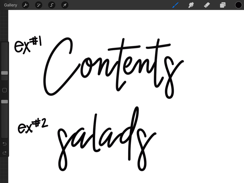
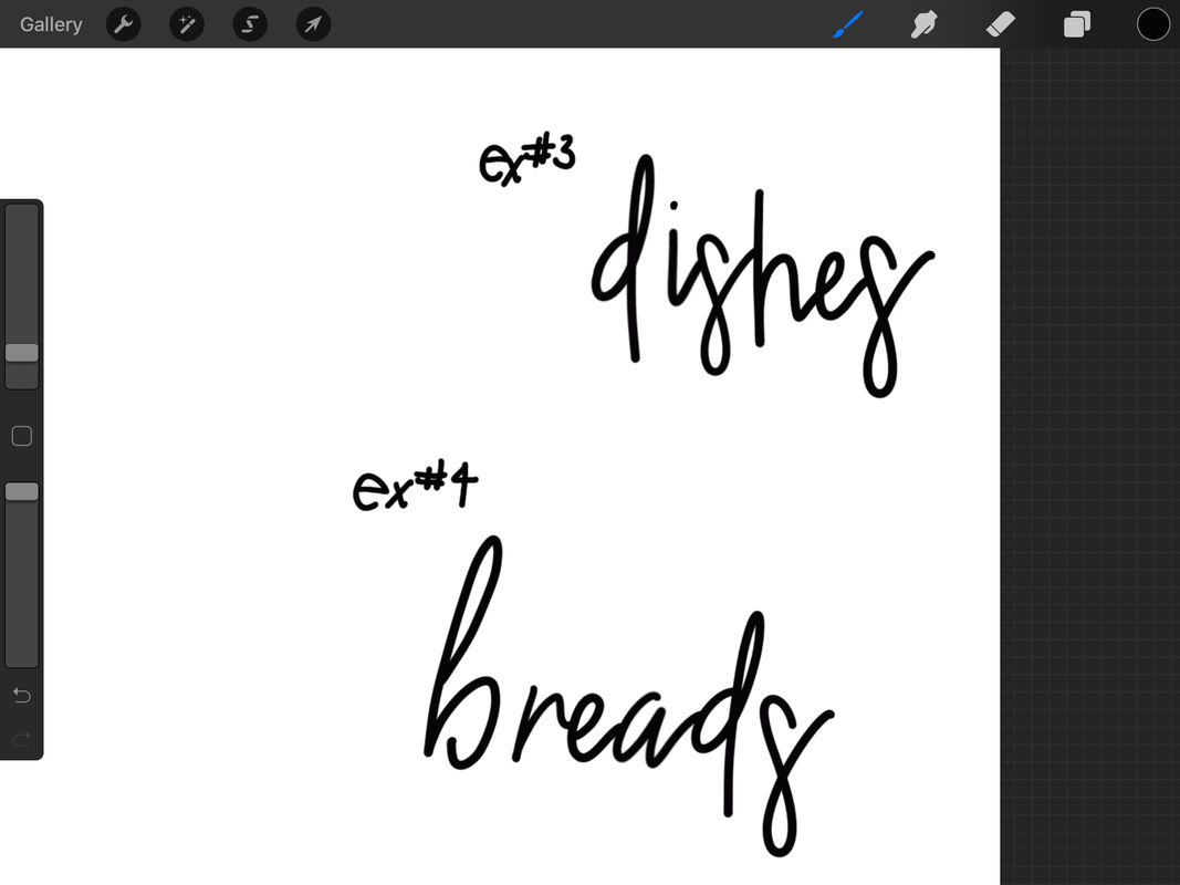
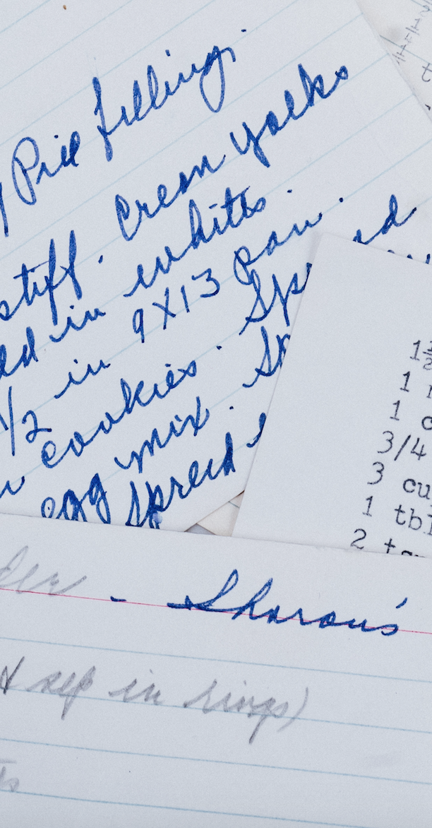
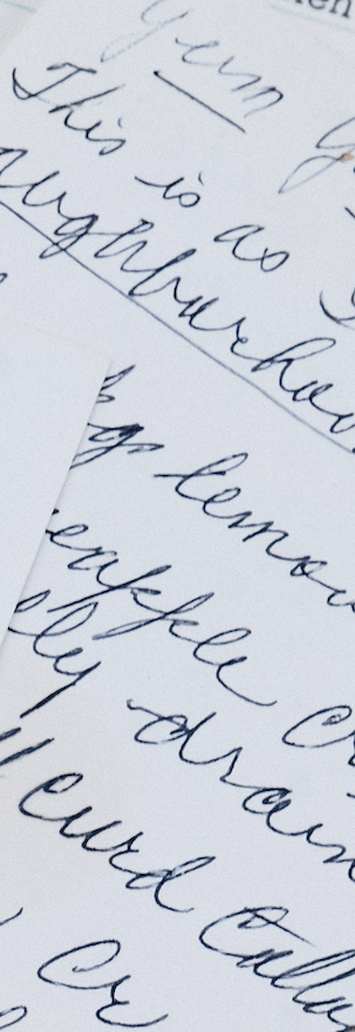
For this project, I decided to make my own typeface for the title pages. As I knew I wasn't using this font for all pages, I didn't create a whole alphabet's worth of letters with this typography. Instead, I designed the words that I needed to match each other. For the decorative typeface, I took my great grandma's handwriting and turned it into a modern cursive font that was easier to read. Here, you will see a side by side of her handwriting and the font that I created. This is where you will notice that I took some of the same elements in her handwriting and put them in my font. |
TYPOGRAPHY
|
|
|
|
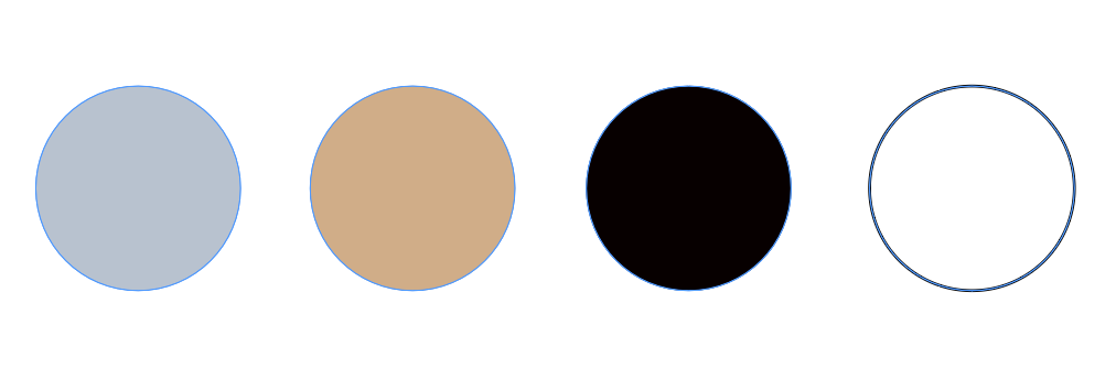
COLOR SCHEME |
MOOD BOARDS
|
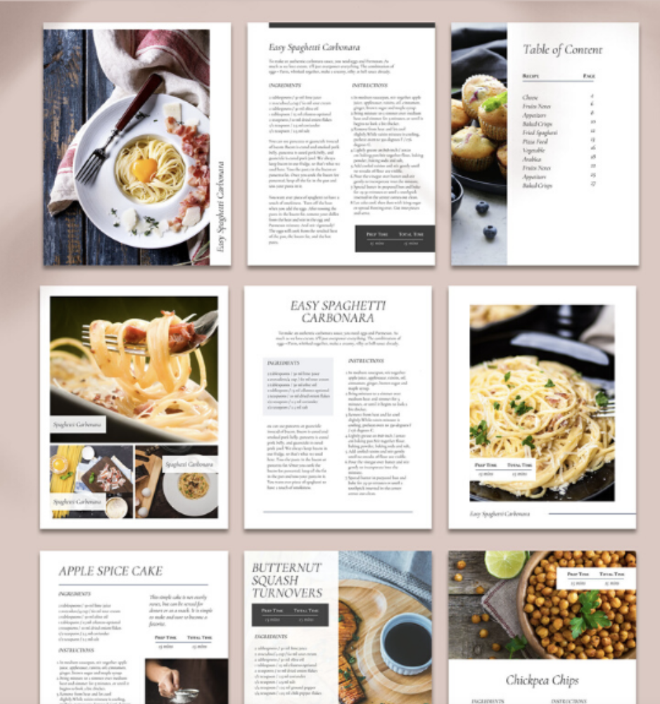
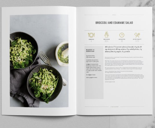
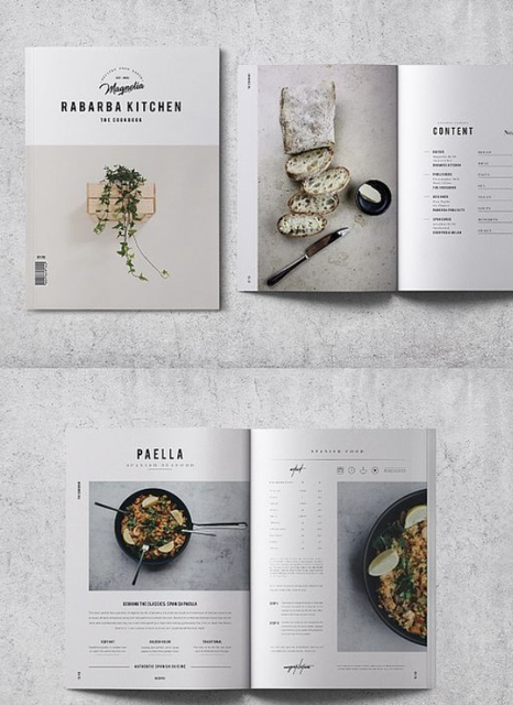
All of these photos are found from Pinterest. In order for me to start my project, I had to get some inspiration. I knew I wanted to go for a more modern look. On Pinterest, I looked up "Modern Cookbook" and came up with the perfect mood board. I wanted to design a clean cookbook that you would see on a shelf in a store.
|
|